
Sizzy is a browser made for web developers. It’s packed with powerful features — but the hero section? It wasn’t doing the product justice.
The old version was clean, sure, but also generic and cluttered. It looked like everyone else’s. No hook. No edge. No soul.
So, we maxxed it.
💡 The HeroMaxx Process
Here’s how a design roast goes at HeroMaxx:
◆ Understand the product’s personality
◆ Break down the current landing page
◆ Use the product to get real insights
◆ Analyze competitors
◆ Define the audience, use cases, and USPs
◆ Roast it
◆ Redesign it ✨
🧠 Research Insights
Audience: Web Developers
Use Case: Browser built for responsive design and multi-project workflows
Competitors: Polypane, Blisk, Responsive Viewer
Problems it solves:
- Built specifically for devs, not general users
- One browser to test across devices
- Manage multiple projects with smooth context switching
- Built-in responsive testing and previews
- Super dev-friendly — works with OSS workflows
- Fast, clean, powerful UI
- Saves time, clicks, and frustration
🔥 Roasting the Old Hero
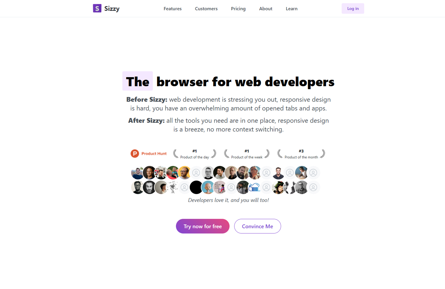
Here’s what wasn’t working:
◆ Headline was generic — blended in with competitors
◆ Subcopy was text-heavy — Requiring more cognitive load to understand
◆ Too many avatars and badges — created visual clutter
◆ The gradient background felt default and unintentional
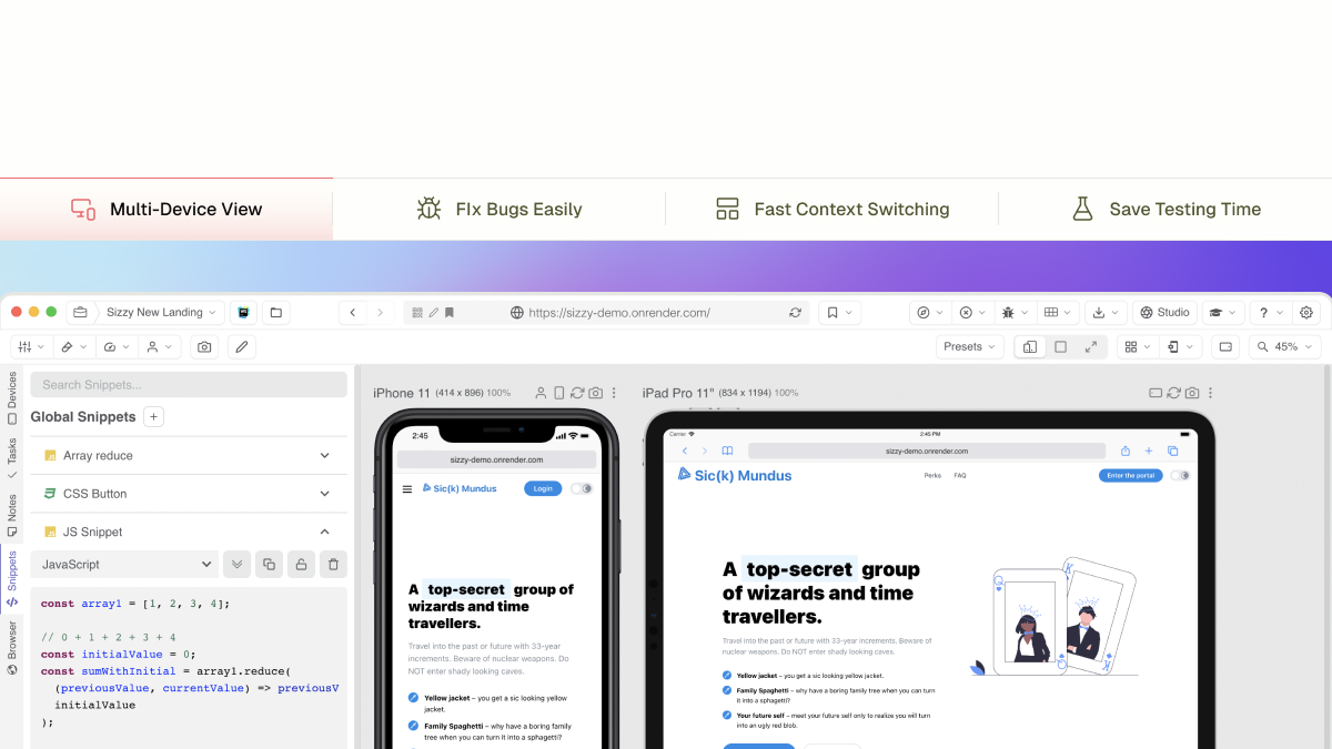
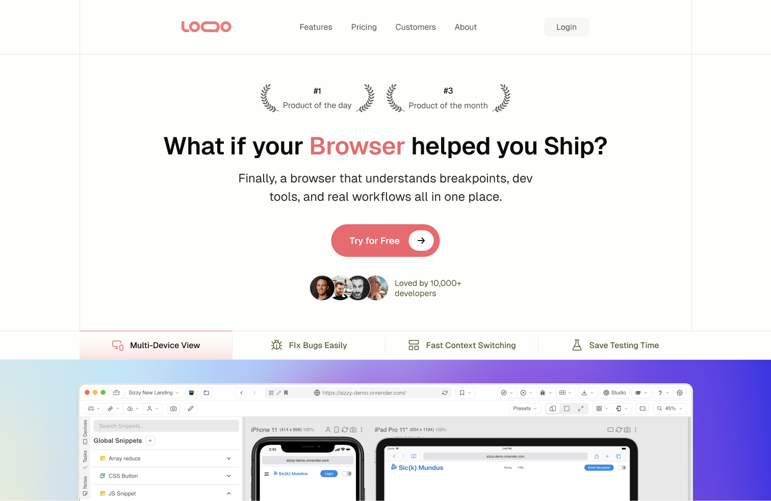
◆ The browser preview was below the fold — huge missed opportunity
💎 Redesign Decisions
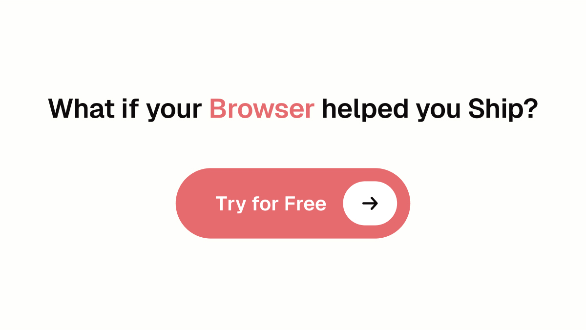
1. Typography That Lands the Message
We switched to Geist — clean, modern, confident.
If the type doesn’t feel sharp, the copy won’t hit either.
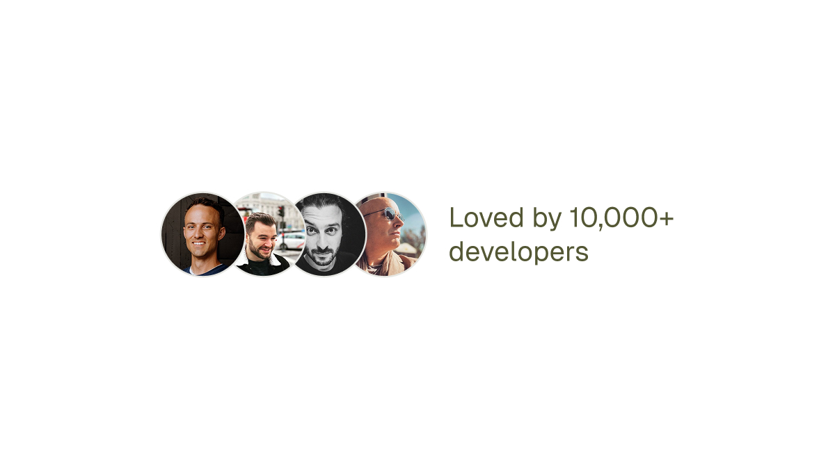
2. Trust Signals That Actually Work
Wall of faces = noise.
We kept it simple — just a few recognizable names like @kentcdodds to build real trust.
3. Color With a Point of View
We kept the vibe playful but intentional.
Swapped the default gradient with a bold reddish palette — warmer, more personality, and more memorable.
4. Copy That Speaks Clearly
“The browser for web developers” could be any tool.
It didn’t speak to user pain points, didn’t differentiate, and didn’t spark curiosity.
We rewrote it using proven copywriting frameworks — focusing on real developer struggles, clear benefits, and emotional hooks.
It now speaks directly to the user, sets a strong first impression, and stands out from the sea of similar tools.
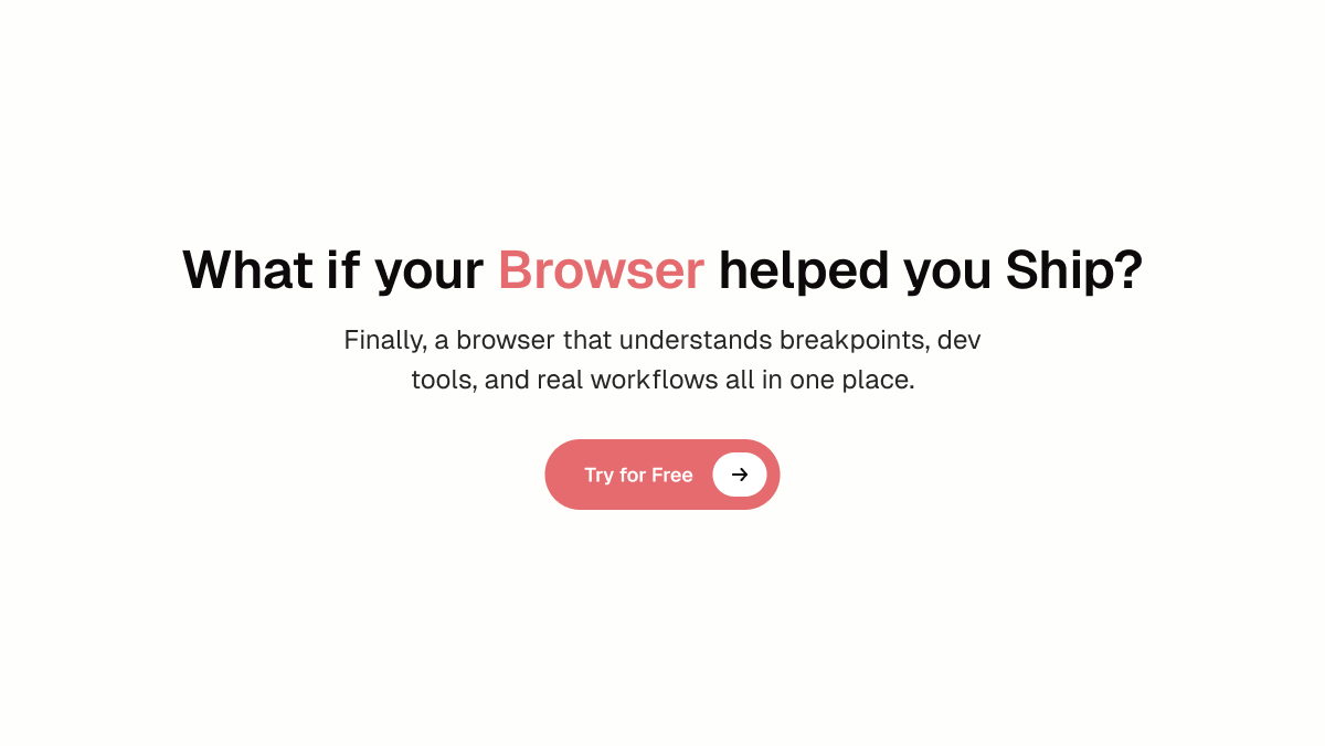
5. Show the Product Upfront
The product is the browser — but it was hidden.
We pulled it up top and paired it with clear benefits so users immediately get what Sizzy does.
✅ The Result
◆ Feels confident and unique
◆ Speaks directly to the audience
◆ Clean, focused layout
◆ Visuals support the story — no filler
◆ Designed to convert
🎯 Our Design Values
Every element has a reason to exist.
No fluff. No vibes-only gradients. No walls of text.
We HeroMaxx to:
◆ Show what matters in 5 seconds
◆ Guide the user visually
◆ Make people want to try the product
We don’t just design.
We HeroMaxx.