Sometimes the best way to explain your product… is to just show it.
That’s exactly what I did with PageAI Pro — a powerful landing page builder for busy developers. The original site was clean, but it didn’t reflect the strength of the product. So I gave it a full design roast at HeroMaxx.
Here’s how it went down 👇
🔥 The HeroMaxx Roast Process
Before jumping into visuals, I always follow a clear process:
- Understand the product’s personality
- Break down the current landing page
- Use the product to get real insights
- Analyze competitors
- Define the audience, use cases, and USPs
- Roast it
- Redesign it ✨
This ensures every design decision is grounded in research, clarity, and conversion.
🧠 Understanding PageAI Pro
While researching, I defined these key points:
Audience: Marketers, Developers
Use case: No-Code tool, AI-powered builder, Website generator
Competitors: Framer, Typedream, Webflow AI
Problems solved:
- Made for busy devs who want to launch fast
- Generates the whole codebase, not just a mockup
- Built with Next.js, TypeScript, Tailwind CSS & Shadcn UI
- Highly customizable templates
- Designer-friendly interface
- Complete landing page in 3-5 minutes
- Full ownership and easy handoff
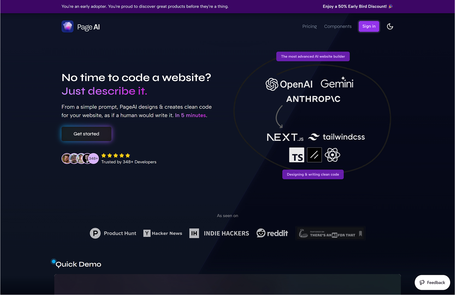
🧪 Let’s See the Original
The original version was clean and minimal — which I liked. But it lacked energy and missed the chance to show off the product’s strengths.
Here’s what I thought could be better:
◆ Vague diagrams — no real value
◆ Generic copy — doesn’t speak to devs or marketers
◆ Neutral CTA — not actionable or clear
◆ Flat hero — lacks depth
◆ No interactivity — no way to try the product
🎯 What Matters in the First 5 Seconds
You’ve got one shot to explain your product’s value. That means:
◆ Say what the product is
◆ Show why it matters
For PageAI Pro, this meant:
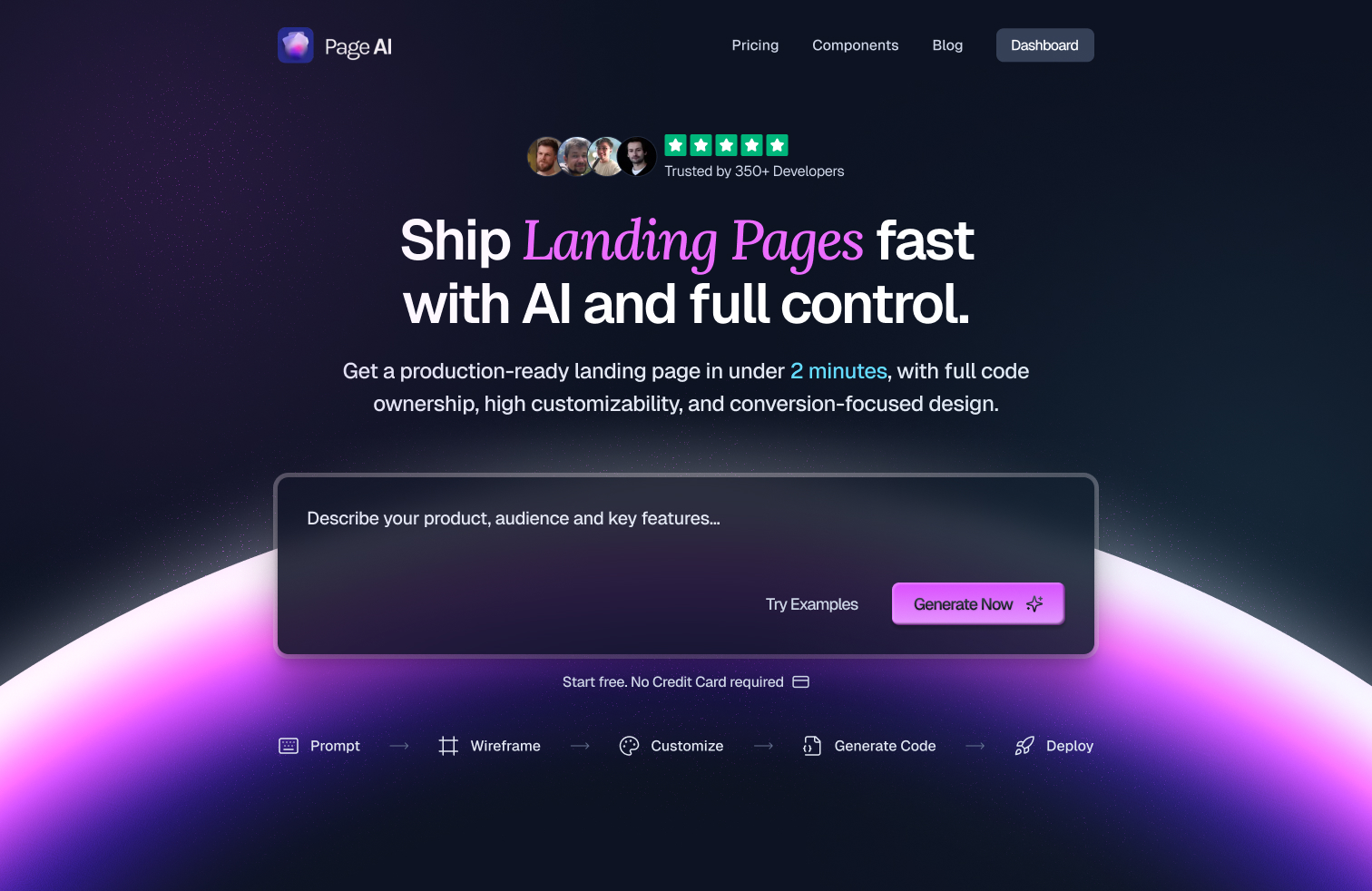
“An AI landing page builder for busy devs — with full code control.”
✍️ Typography with Personality
I chose Geist as the primary typeface — clean, modern, and developer-friendly.
Then I paired it with Lora to bring in some character and warmth.
It’s a subtle combo that balances clarity and brand feel.
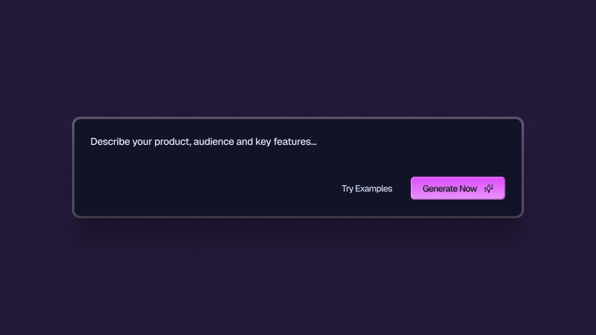
🤖 Let the Product Speak
Since the product is strong, I wanted users to try it upfront.
So I added a small AI chatbox right in the hero. You can type a prompt, and see the product do its magic. This kind of interaction builds instant trust.
🌈 Color with Intention
I kept their existing palette, which already worked well — but added more depth. I used colors more intentionally, especially for CTAs, to follow strong UX principles.
Contrast = Clarity.
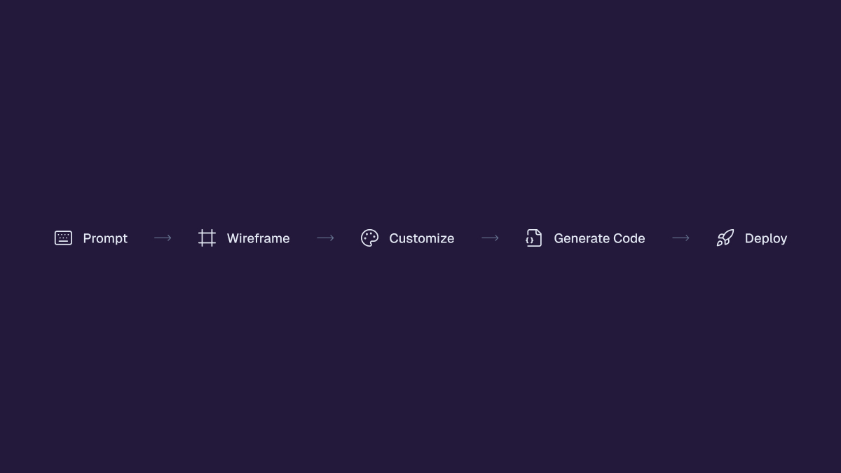
🛠 Set Expectations Early
People don’t like surprises. So I added a simple stepper to show the journey.
This helps guide users and makes them more likely to take action.
✅ Remove Friction, Add Hooks
To lower hesitation, I added copy like:
“Free to get started. No credit card required.”
It’s simple, but effective. It gives users a reason to click, right now.
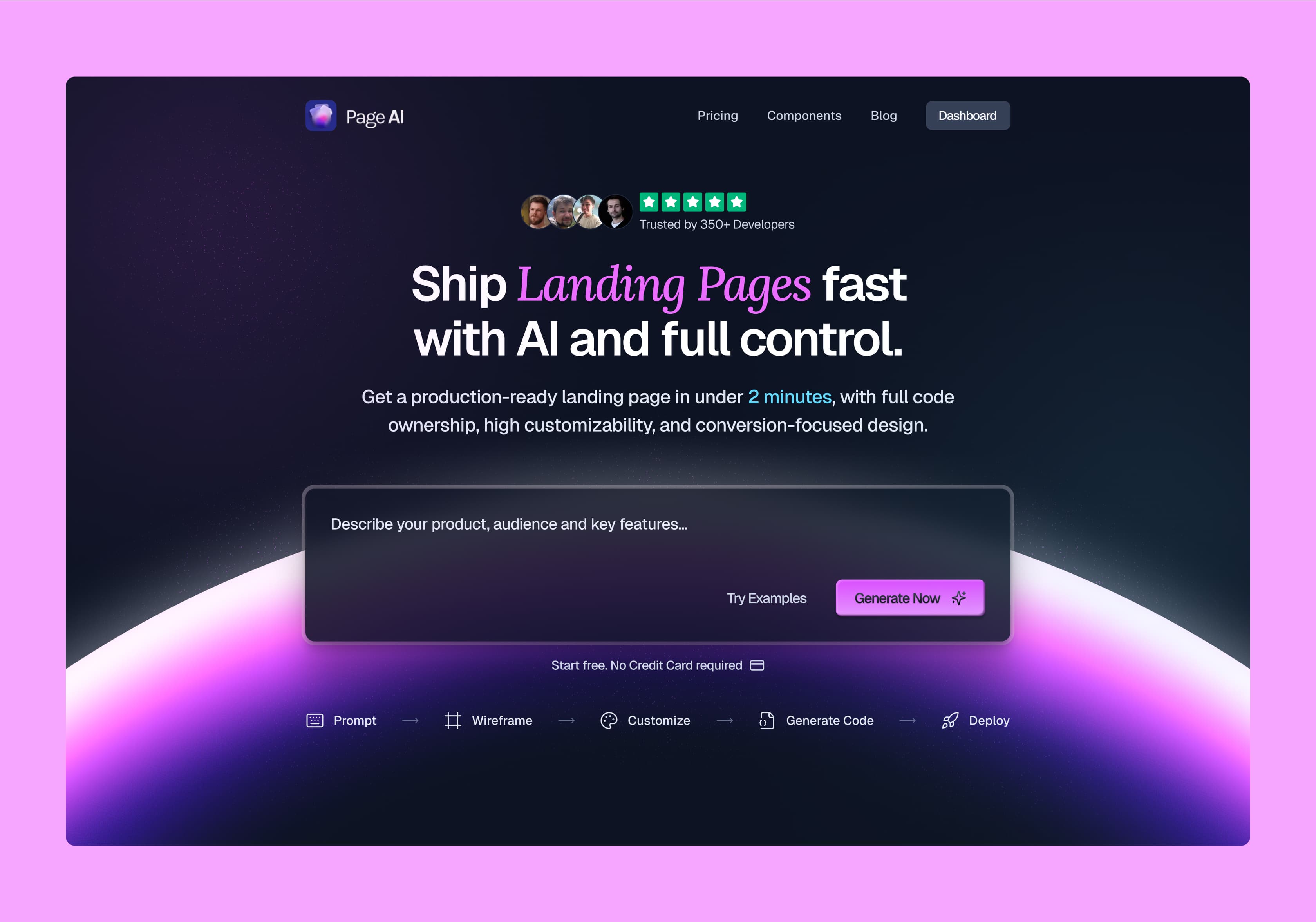
🧩 Final Result
Brought everything together into a polished new hero section:
- More depth
- More clarity
- More interaction
- Stronger CTA
- Product-first storytelling
🚀 Final Thoughts
This wasn’t just a redesign. It was a rethink — grounded in real product insights and strategic design decisions.
Want your product’s landing page to actually convert?
Let it speak for itself — and let me help you do it right.